The new version of challenges is out!
Every year over 2 million challenges are played on Funbridge. It’s very simple: you have made this game mode your favourite, putting it on par with series tournaments. Needless to say that we always think twice before making the slightest adjustment to such an appreciated game mode…
And yet, we have dared to give a new look to challenges 😱 Not scared at all! Because we have been guided by your suggestions from satisfaction surveys and this blog. Follow the guide! Here is a tour of the new features.
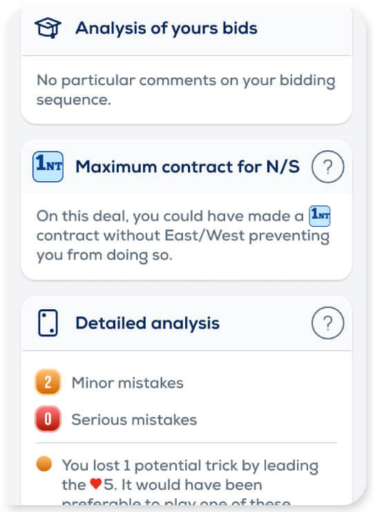
Analyse your games (finally!)
This is THE main suggestion that many of you have made: adding end-of-deal analyses, an option that was until now not available in challenges. You have it now!
After each deal played, you can now check that your auction was the best, the maximum contracts makeable or even analyse your card play mistakes.


Gain the psychological edge
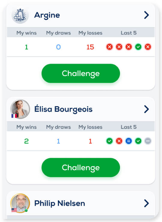
Next to the number of wins, draws and losses vs each of your opponents, you will now find a summary of your last 5 challenges. It is a way of tracking the recent trend in your challenges.
You are 20 wins behind but you have won the last 5 challenges you have played? It seems that your recent efforts have paid off 🏆! On the contrary, you have failed to win your last 5 challenges? Your opponent has gained the psychological edge, it is time to play tight games 😤
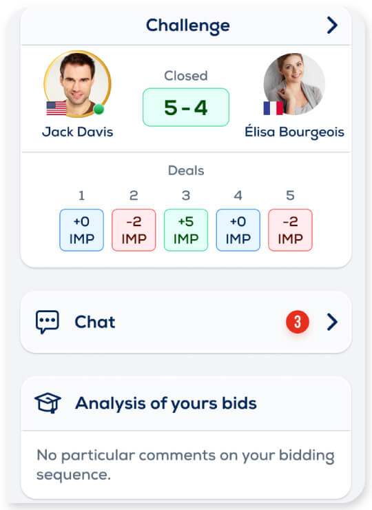
Quick access to the chat
The new end-of-deal screen includes immediate access to the chat with your opponent. Don’t miss the opportunity to congratulate him on a nice manoeuvre or thank him for a good game before challenging him to a rematch. 🤝
If you are friends, you even have the right to tease him after a splendid victory of yours 😈
A little brushstroke for a fully modernised game mode
We couldn’t resist the temptation to kill two birds with one stone and give this game mode you like so much a makeover. We are pretty proud of the result and we hope that you will like it too!
The new interface is easier to navigate through and more straightforward, especially for those who are new to the game. If you have never played challenges, stop reading now and go try them out! Don’t know who to challenge? You can find a random opponent or take on Argine.
As you know, your opinion matters a lot to us. You will have noticed that these enhancements mainly come from your suggestions.
So, what do you think of this makeover? Do you have any other ideas for challenges on Funbridge? If so, let’s discuss in the Comments section below!
And feel free to challenge me on Funbridge 😉


I am having difficulty understanding the new result format.
I clicked and nothing happened
The new version is extremkyla bad. Plebsen let me go back to the previous version!!
Agree
I can’t coment, bé au se
I much prefer the previous version!!
I agree! This is no longer “Fun” Bridge!
I really like the new version!
Sounds like these additions will be excellent and add to the fun of challenges
I think you did a nice job. I had and still have to get used to it, You offer more detail information now, a little bit at the cost of the overview.
Horrible
Bach to previous version
Agree! Just let us play bridge!
I don’t like the new version. I’m not a great bridge player but I enjoy playing and chatting with all the friends I have online. Just let us play and stop trying to make everyone superior bridge players. I don’t like the new format. I just want to play a hand of bridge and hope for the best!!’
More boards option please.
Why are the challenges IMP bs MP?
Another unnecessary and horrible change to a (formerly) clear and easy to navigate Funbridge format.
There is TOO MUCH VISUAL CLUTTER in this new version. This clutter DETRACTS from the fun of the game.
Please…..assign your web designers the job of creating a new game instead of continually spoiling a (formerly) good thing!
I agree with the LESS THAN ENTHUSIASTIC comments from players above.
As long as the tempo continues to be acceptable and not ‘s l o w’ I will remain a happy bridge player and do not need ‘mod-cons’ to distract me from the enjoyment of SIMPLE PLAY.
i.e. I am NOT a professional and dont want to be!!!
Terrible lauout – let us have the possibility to use the old version
I prefer the previous format
Can you please try to explain what kind of bridge we are play at this time I been play party bridge for some time at this time I think is not the way I play
And the score ‘s are so different I don’t know way this way of playing and scoring I’m confused
Please rispond
I don’t like spend my money at this game I’m not happy please please if you know how is playing I will be so great full
Life is good !! Ciao
You need to set up a game and describe how you do each function from getting through the play and then afterwords going back and seeing what your opponent did and accessing his hand etc. it’s not clear but I finally figured out that you have to click on the microscope glass in order to go back. I think there’s a way to play a trial game showing all the features as opposed to just talking about them show them in the context of a game. That would help! Papa T in Kentucky
I am finding the changes difficult . Useful to know how I have played but no idea how I have played against other person or my rank8ng anymore
Excellent makeover. I would like to see one more feature added. Like in the previous version, out of the pending unplayed challenges, it is much easier to know which opponent has already played the deal by just clicking on the play, this feature is probably not there in this version.
Hate the new foremat. Will cancel if you don’t change it back to the way it was!!
Thank you for all your comments! The general reception of these new features is not very positive (note the euphemism). But we are glad that you are quick to express your problems and sometimes even suggestions to solve them. It’s very interesting and we’re in the process of using your feedback to improve the display.
It’s impossible to get it right the first time – the old version wasn’t perfect either, as it didn’t allow for end-of-deal analysis – but thanks to your feedback we’ll get there faster.
Don’t like it at all. Difficult to find out how opponent did. Seems to be designed to sell premium subscriptions. Now I can’t even find how many hands I have left because I buy a set number of deals, not a yearly or monthly subscription. Please give us the option to return to the old format.
I must get accustomed to the new format, but I like it! I think the play critique is very useful for game improvement. It is new, but we should give it a chance!
I HATE this new format. It is so unreadable I am considering cancelling my membership. PLEASE RESTORE THE OLD APP
I am the same opinion
Please do the Old Version again !
Deze nieuwe versie is vreselijk!!!! Heel onoverzichtelijk! Wat was er mis met de oude versie?
Too much visual clutter in this new version. The prior version was much simpler and direct. So much clutter in the new version it is difficult to determine where to even begin to play a hand.
Either please restore the old version or give us an option to play the old version.
It appears to me that the purpose of the new version is to convince people to upgrade to the more expensive monthly/yearly Funbridge. Too many of us can’t afford that.
I noticed that……after months of S L O W play (it took forever to play a hand) I eventually decided to renew my subscription – 10 euros more than last year! It’s not that I’m ‘in to win’ but after months of tempo slowness causing loss of concentration during play, I now think they were working on this new system rather than ‘fixing the old one’
I do not like this new version. It is too ‘busy’. Please revert back to the previous version. It was clearer and clean.
The analysis is interesting but the new layout is a disaster. Much prefer the prior way of display challenge results and history. The last five graphic display is pointless – wasted screen space.
Please bring back the old version! This is too cluttered and too many clicks to get information that was already on display. ☹️
I hate the new format.It is good that we have the analysis but we have lost the ease and simplicity that made it attractiveAlso note the price rise not appreciated
I do not like this new version AT ALL,
Please return my old version or I will stop my subscription
I do not like the new format. I find it confusing. Its hard to go back and review the hands! Please go back to the old one which I enjoyed.
What an awfull version! Please take the former one! It‘s horrible ! Why changing a winning team?
I hate the new version, it’s too busy! Please revert to the old version which was clean and simple.
Why yo took out the rankings I’m challenges? Please put them back .
The rankings kept me going !
Not user friendly this new version . Too many features complicate . Going back to bridge base
Hating this new version
Good evening to all! I’m back to comment again to give you some news from the development team.
First of all, even if a lot of comments are negative, I want to thank you for your commitment. This new blog released a few months ago had as main objective to allow us to discuss more easily with the players. From this point of view, what a success! We are delighted to be able to collect your opinions and suggestions. The last few days have created a real buzz in the team, which has been racking its brains to analyse your feedback and find satisfactory solutions for everyone.
Secondly, a few words about the latest developments. We have already released 3 updates to the web version (PC and Mac) since yesterday, taking into account some of your comments. For example, you now systematically go through the challenge summary page to better see the running score and the remaining deals to be played before going to the game table. You can also see which deals have already been played by you or your opponent thanks to the appearance of a small profile picture under the deal number. On the end-of-deal page, which contains the analysis, a “Deal List” button makes it easier to navigate between the deals already played. The Android and iOS versions have also been updated, with much the same changes. More are in the pipeline.
Third, for the future:
1. Many of you were confused by the web version because your game and your opponent’s game are no longer compared side by side but one below the other. We made this choice to offer the same experience on computer and mobile. Indeed, on mobile we don’t have enough space to fit all the information. I can tell you today that thanks to you, we changed our mind. I am currently testing a web version with the side-by-side comparison and I think you will be happy with it. It will probably be rolled out next Wednesday or Thursday.
2. About the display at the end of a deal: we chose to display the window containing the analyses because it was the only game mode that did not have these analyses and many players had regretted it. So we will not remove these analyses. However, we are thinking about how to avoid imposing them on those who are not interested at all. This particular subject is a delicate one to arbitrate, so I cannot give any further details at the moment, but I can assure you that we are thinking about it.
3. Rest assured that we are listening very carefully to your comments. You can see that several updates have already taken place and that others are coming. As I said before, your suggestions allow us to find the right balance between the modernization of Funbridge and the need to satisfy our users, some of whom have been trusting us for almost 20 years, and who are particularly attached to Funbridge and to the pleasure they get from playing bridge.
Thank you and see you soon!
Please give us the old version !! We all hate it
I hate this version please give us the old one thanks !
I find I the new version very confusing, there must be simpler way of giving people the extra information they want
It just looks so messy!
I find I the new version very confusing, there must be simpler way of giving people the extra information they want
It just looks so messy! Wolf
Good to know the side-by-side comparison of our games will be coming back. The new version of that page is very hard to understand.
I think new version a little confusing at first but now it’s fine. I like the analysis of mistakes.
Wanted to give a bit of time before I made my decision, but I still do not like the new version.
Too much visual clutter and overly complicated. Why change something that’s good?
Sorry, not for me.
I suspected the slowness we have been experiencing…and finding exasperating,, was due to charges in program and expected a more expensive and complex alternative would be presented soon..and here it is! The monthly fee is considerably higher,great timing, we are in the middle of inflation, and as I already have a subscription this monthly increase is confusing. I have so enjoyed this program, the fun of competition with friends in different parts of the country and just the joy of daily contact by playing a great game. I look forward to you continuing to work on a winner game.
How do I go back to the old way?
What a disaster I do not know why it was necessary to change the scoring format from previous versions. I do not like this new version in any shape or form. There is an old saying that unless it is broken don’t fix it. There was nothing wrong with the previous version. The add-ons such as commenting on the play are well received
I hate this new version. also, when checking what I could have done better it advised me that I have to upgrade to a Premium subscription to get the answer! Please change it back.
I see no merit at all in the new version. Far too much clutter. What was wrong with the old one?? Why the restriction to just 5 previous challenges?
Please,
back to previous format
Too complicated the new one
the old format was better
I don’t like this new view, it is cluttered which detracts from what we’re here to do. Much preferred the previous format.
I intensely dislike it, or more bluntly, I too hate it! It’s confusing, it’s not user friendly,it’s an awful interface. Please restore the original, clear one!
This is my first evaluation. I intensely dislike it, or more bluntly, I too hate it! It’s confusing, it’s not user friendly,it’s an awful interface. Please restore the original, clear one!
Clunky, not at all intuitive and not an improvement on the previous set up.
I like the hand analysis. I’ve gotten used to the format. But how are the challenges NOT listed with the ones expiring soonest first?? Please fix that!
I don’t see improvement. As someone put it so well….this new version is a disaster.
User UNfriendly. Visual clutter. I have stopped playing challenges….was previously consistently in the “congratulations you are one of the players who won the most challenges this month” category. I am seriously considering dropping my Funbridge subscription. You had a good thing before and it has been severely spoiled! I echo all those who say…return to the previous format. Entirely!
Agree with many others, this new version lack a decent overview and have too much visual clutter. Please give back the old version, at least as an option!!!
non esiste versione peggiore .
Help my
Ich kann nicht mehr mit meinen Freunden spielen.
Kein Premium
Good to see the side-by-side display back. And having the option to click-through to see the detailed results. Perhaps the icon that is used for that click-through button could have a green tick if there was ‘perfect play’ to save clicking-through.